MEGA
modular typeface
personal project

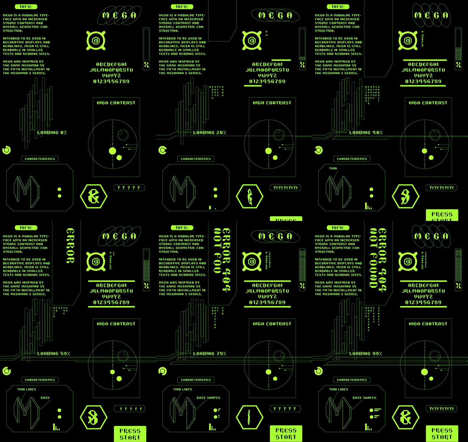
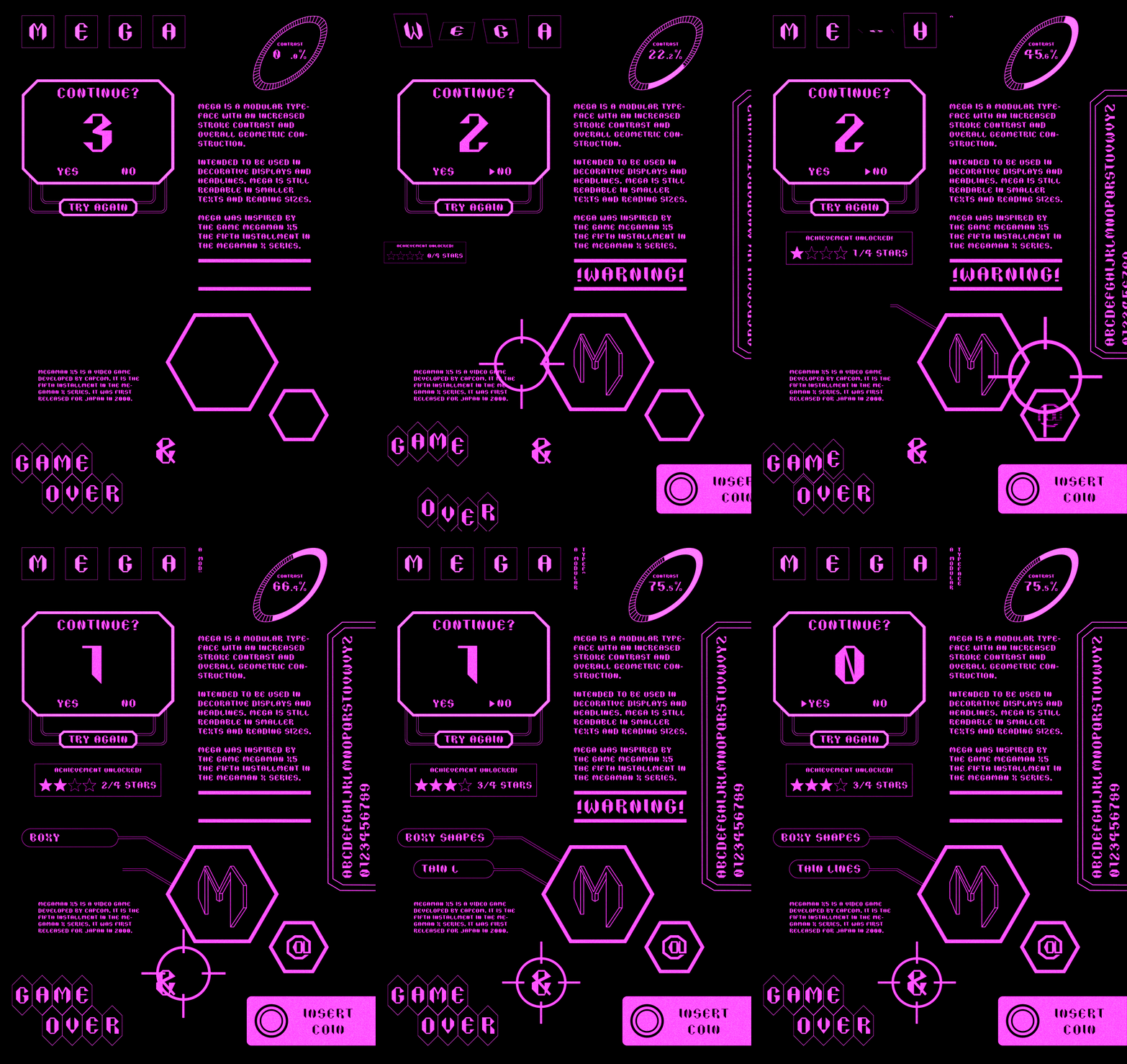
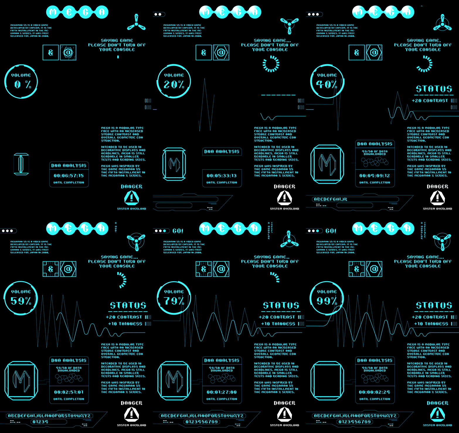
Mega is a modular display typeface defined by high stroke contrast and geometric construction.
Inspired by the bitmap fonts and custom typography of Mega Man X5 and the 16-bit era of video games.
I admired the sharp edges and stylistic choices of the game’s typography and how well they complemented the game’s futuristic and modular interfaces.
The Challenge
I struggled with translating the energy and expressive character of an action game into a structured, systems-based typeface.The design needed to feel dynamic and distinctive while maintaining consistency and legibility across the full character set.

The Goal
The goal was to create a condensed display typeface suited for headlines and decorative applications, while remaining clear enough to function at smaller sizes.I also wanted the letterforms to reflect the modular, high-contrast visual language found throughout Mega Man X5.
Type Specimen Posters

The Solution
I developed the typeface around a condensed 3:4 proportion to create a narrow silhouette that uses space efficiently while maintaining legibility.Bold, angular vertical forms were paired with significantly thinner strokes to create a distinctive contrast and establish a consistent modular construction system.


Outcome
The final typeface combines the sharp, mechanical character of its source inspiration with a cohesive geometric system.Mega functions as an expressive display face while demonstrating how a limited set of proportions and modular forms can generate a unified character set.

Instructor
Min Hee Lee
Design & Animation
Larry Won